Work Experience
- Owner, Head of DesignRainfall — WA, USA
- Design Director (Advisory)Fantasy — NY, USA
- Design DirectorFantasy — NY, USA
About Me
I founded the design studio Rainfall with the simple idea that most clients would benefit from thoughtful, passionate creative partnerships with people who care about the success of their business.
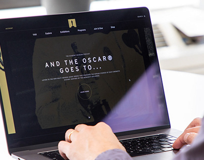
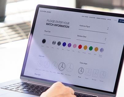
I have produced useful, award-winning work for several well known brands and
top creative agencies.…
Read MoreMember Since: January 29, 2014